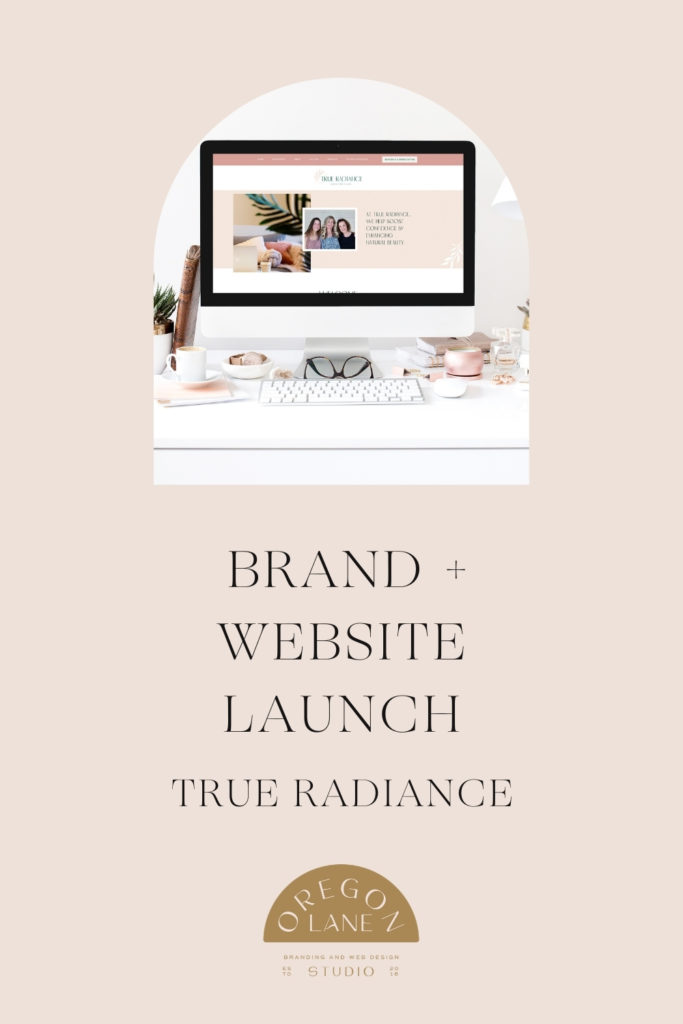
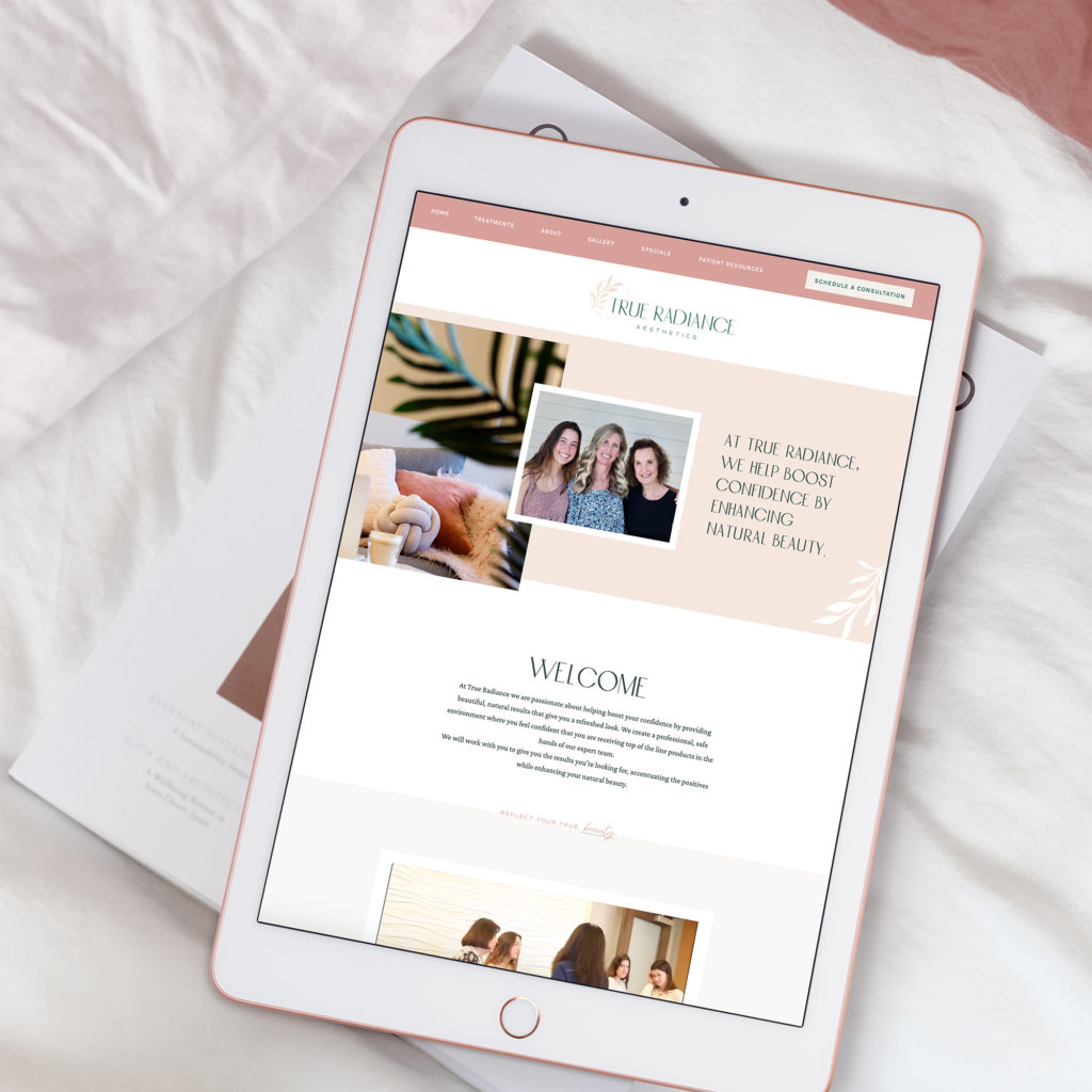
I am SO excited to announce the most recent client website and brand launch for True Radiance Aesthetics, based in Carlsbad, California! I provided custom branding and website design for this incredible company and I am thrilled with the result.

Here is a little background on the process we went through for their custom branding and custom showit website design.
Branding Phase
Their new space is near the beach in Carlsbad, CA, so we went with an organic feminine feel for their branding. I designed logo concepts with hand drawn florals and custom typography for a unique design. It was really fun to experiment with each variation and see which one the client ultimately picked.
Their palette is blush/neutrals with pops of emeralds. I love that it feels like a beach in California AND also has the organic elements that you find in nature. California is known for their incredible landscapes and I loved creating those subtle hints in their branding.
Website Phase
We created an aesthetically pleasing design that will attract their ideal client. Their homepage focuses on their education and experience in the aesthetics industry and provides an overview of their services.
They have a total of six pages:
- Home
- Treatments
- About
- Gallery
- Special
- Patient Resouces
I added in a few fun transitions to keep the user engaged. We made sure to include several ways to Schedule an appointment/consultation throughout the side to make it easy for the user to get their appointment scheduled. It’s really important to create a call to action on every page of your website, regardless of being a service or product based business.
Your consumers need to know what to do next, and the call the action is a great way to guide them from page to page or to book a consultation, grab an appointment or make a purchase.

Our favorite parts about this website design
The use of layers, their custom illustrations and how beautifully their branding elements are incorporated on so much of their site. I also love their video on the homepage which really helps the user get a good feel of the friendly and professional environment. Incorporating movement really helps a site WOW users, so I encourage my clients to include video whenever possible.
A reason I love Showit so much is that it allows you to do all of this without code. And the client can take over their site and make edits on their own.
It’s the little details that makes each site so unique!
Give True Radiance them a follow on Instagram and take a deep dive on their new website too!
Interested in your own custom Showit Site or Branding? Click HERE for more details or book a consult HERE. I also have a new template shop, if you think a DIY may be a good fit for you!


