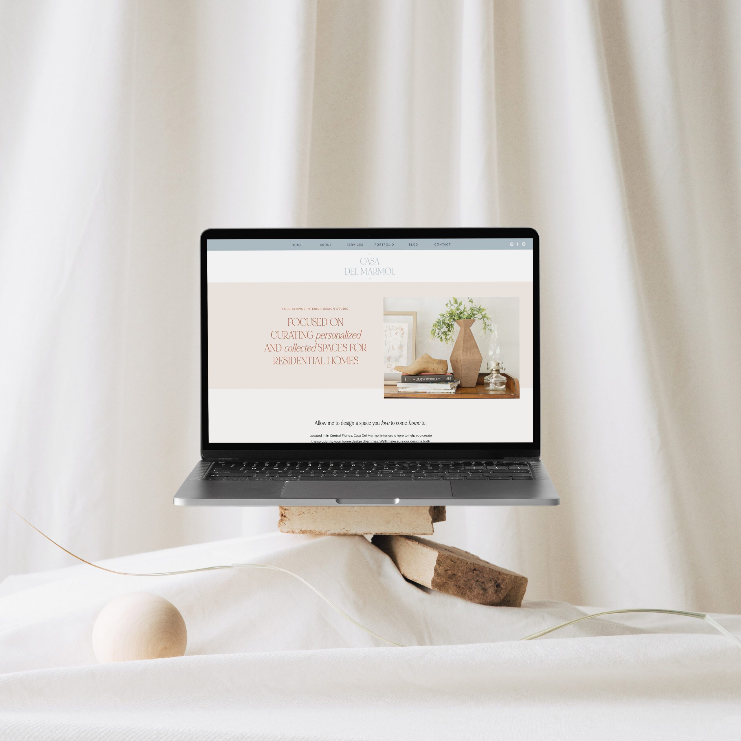
As a website designer, I have tried many of the most popular website platforms – WordPress, Squarespace, Wix, you name it. I thought Squarespace was going to be my go-to platform but felt frustrated by the design limitations. Once I tried, Showit, I was hooked! Here’s a rundown of why I switched my website to Showit.
Creative flexibility
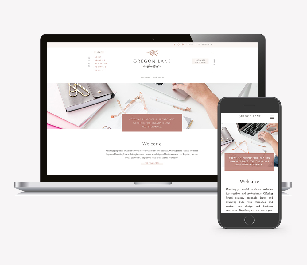
I would describe designing in Showit like designing in Adobe Illustrator with easier, stripped down design tools. Now this may seem daunting to non-designers but it’s soooo easy to get a hang of! I was amazed how you can layer items on top of each other, use transparencies, add icons right within Showit and import your own custom fonts. It’s seriously a designers dream!
Not locked into a grid
When I first built my website, it was built on Squarespace, which is great too, but without knowing a lot of code, I felt limited. I thought it was pretty easy to customize but felt tied to the original theme and felt boxed in to a grid. I also didn’t like how you couldn’t customize the mobile differently from the desktop.
Amazing customer support
Showit has a pop-up chat feature to ask the amazing support team if you are ever feeling stuck. They are SO incredibly helpful and prompt. It’s reassuring knowing they are there if you ever need their help.
Showit help docs and FB groups
Another place to look for help or answers with your questions are the FB Showit user group and the help docs. I can pretty much always find my answer there. Showiteers are so eager to provide help, I’ve learned a lot just by being in this amazing group and reading others questions and answers.
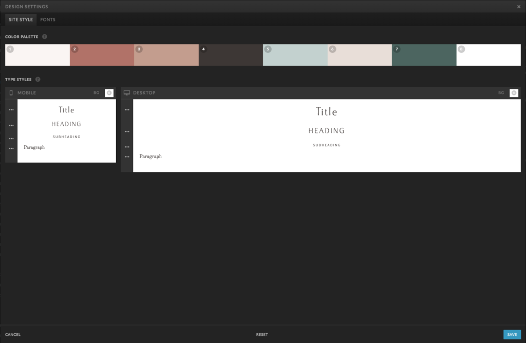
Easy to give your site a refresh
If you go into the design setting within Showit and switch up your fonts and colors, it’s a super easy way to give your site a quick refresh!
Easy to update
Even if you have hired a designer to design your website for you, it’s very easy to go in, add pages or content to your already existing site. No need to pay a designer a monthly maintenance fee. It’s super easy to drag and drop your photos or change copy from what is already there.
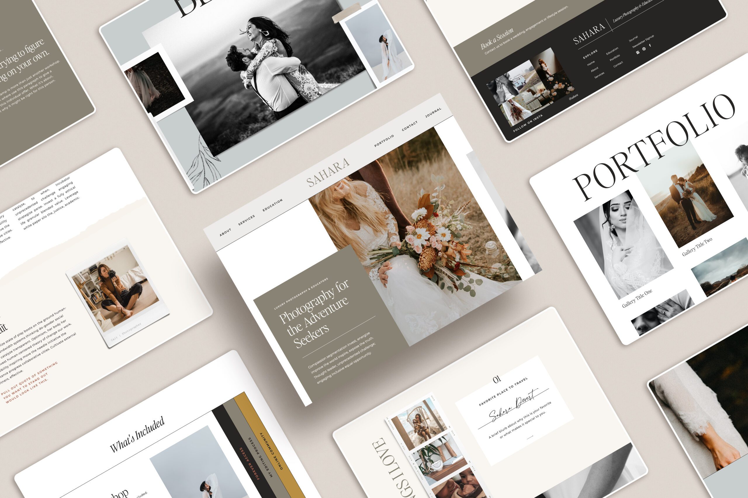
Beautiful templates available
It seems like Showit templates are everywhere lately! I even have a shop full of Showit templates you can check out, or you can download my free one to try it out. There are beautiful options just waiting for you to customize them and make them your own! I’m sure you’ll find one to fit your needs.
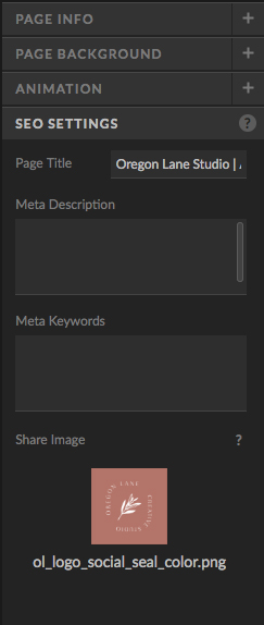
Built in SEO
Within the design panel on the right hand side, this is where you can place your share image, page title, keywords and metadata all to help Google find your website.
Can customize mobile
This is a huge reason I love Showit! You can choose to add or takeaway elements from mobile. Sometimes desktop design elements don’t always work on mobile and it’s nice to be able to hide from mobile if needed.
Connects with WordPress
This is beneficial if you have a previous blog and want to migrate over your content to your Showit WP blog. Even better, the Showit support team will help migrate this for you if you are on the correct tired plan.
So if you are not on Showit, I’d highly recommend you check them out! As a designer, I love how creative you can get with their sites without knowing code. I am so passionate about Showit, I even decided to attend Showit United this year as a Showit designer. I’m so excited to give 1-on-1 consultations with the attendees about their branding and websites and well as speak on panels about branding. I cannot wait to share what I know as well as meet some other amazing designers.
