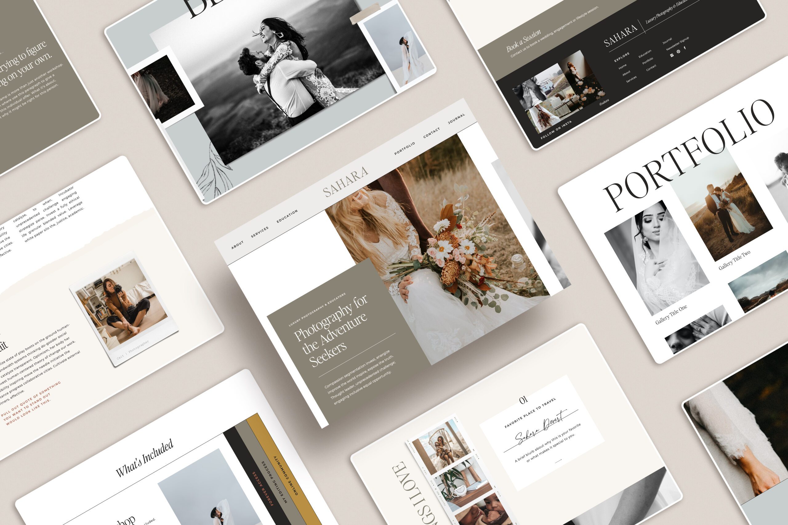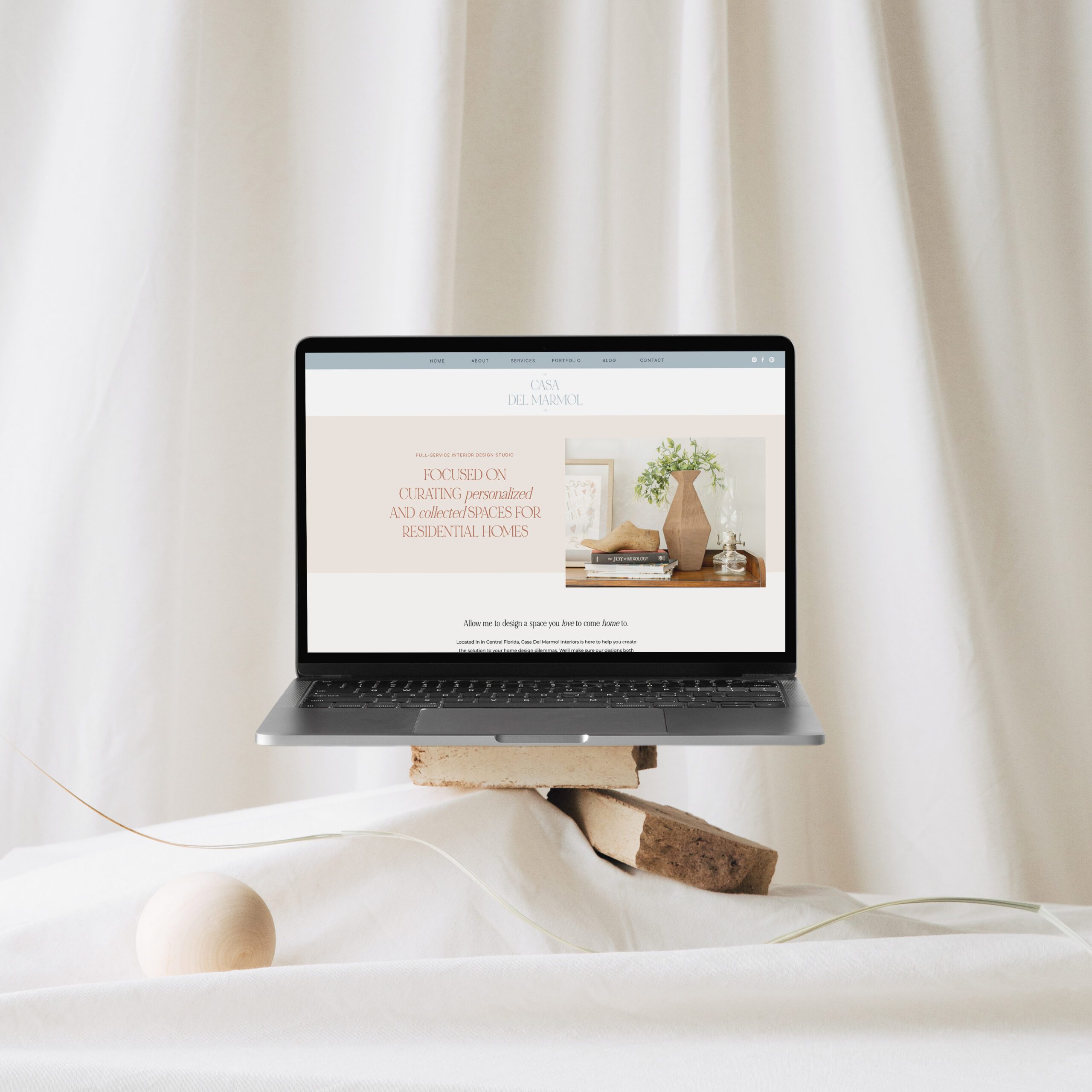
One thing you may already know about me is that I LOVE typography and it’s always my favorite part of any design project. The font you choose can have a big impact on your design and bring it from MEH to Ah-mazing.
When I was building my most recent Showit website and looking for the perfect fonts to use, I realized there were SO many options available to sift through. So instead of searching for hours for that perfect one, and then having to do it all over again the next project, I jotted down several fonts I liked and paired them together for future use and to share with my audience.
Years ago when I was doing web design, we were pretty much limited to Arial, Verdana and Georgia. Anyone else recall those days? The use of fonts on the web have come a LONG way so take advantage of all of these you have available to you to make your site fit your brand style.
Here’s a roundup of my top 5 Google font pairings for you to use on your website. The best part is – they are free!
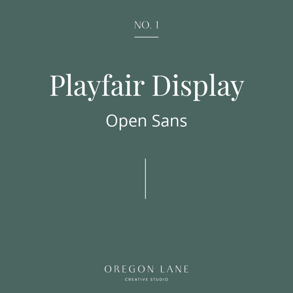
No. 1 | Plairfair Display and Open Sans
Playfair Display is one of my go-to’s and favorite serif fonts. It even looks great in italic for an alternate subtitle. Paired with the classic Open Sans and you’ve got a perfect match.
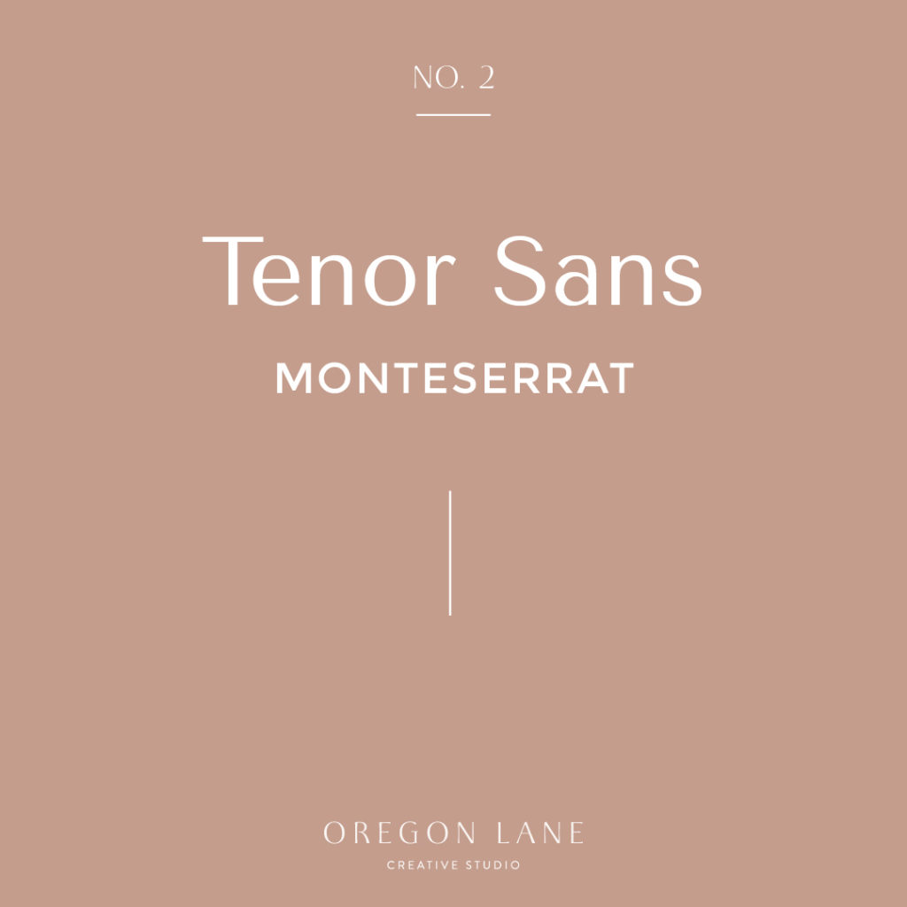
No. 2 | Tenor Sans and Monteserrat
Tenor Sans is one of my recent finds. It’s similar to the trendy “80’s” fonts I am seeing everywhere but is still very legible on web. Monteserrat is one of the best web fonts for when you want to use in smaller text such as your navigation and buttons since it’s such a thick clean san-serif.
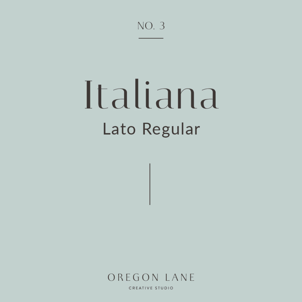
No. 3 | Italiana and Lato Regular
I recently stumbled upon Italiana when I was designing my Showit Template, which I will be releasing very soon! You can see a sneak preview of it on my website if you’d like! Lato Regular is a nice and clean san-serif – perfect for body copy or for when you need smaller areas of type.
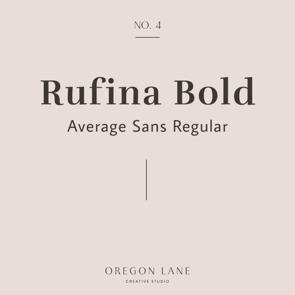
No. 4 | Rufina Bold and Average Sans Regular
I love a beautiful serif and Rufina Bold fits the bill! It’s bold, yet still delicate and not overpowering. Look at that playful “g” in the Average Sans, don’t you just love the character – nothing average about it!
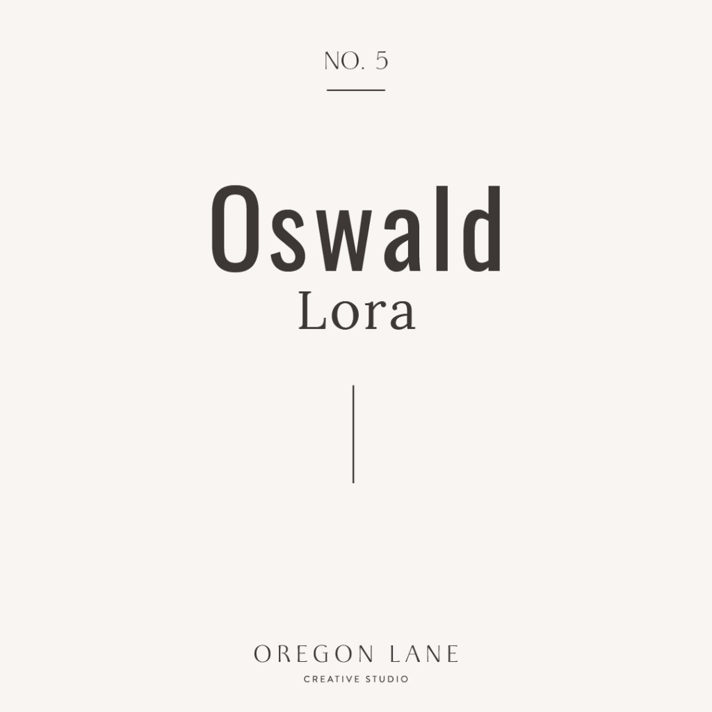
No. 5 | Oswald and Lora
Oswald is another one of my go-to favorites! I think it’s a perfect subhead and button typography choice. Bonus that it looks great in all-caps and doesn’t take up a lot of room, which is something to keep in mind for mobile. If you prefer a serif body copy, Lora is a perfect choice. Its serifs are subtle and understated which presents an easy to read, delicate feel.
Well, those are some of my favorite free Google Fonts for you to use on your website. You can find these fonts here as well as 1000’s of others! Good luck pairing your next website fonts. I’d love to hear what your favorites are!
