Let’s review these top 5 must-haves for your Showit website home page. Often, I think one of the best ways to think about a home page of a website is to liken it to the exterior of a house. When a visitor drives up to a house, they can see the number (so they know they’re in the right place!), the color of the house, how many stories the house features, and so much more. Essentially, the exterior of a house captures some of the structure’s most important details, and it allows for anyone to quickly download information about it. But, to learn more, a visitor will have to ring the doorbell and step inside. Your website home page serves the same purpose.
The goal of a great website home page is to share the who, what, where, why, and how behind you and your business. A visitor to your site should be able to learn the most important details quickly. As they’re reading quick snippets, the next goal is for the visitor to click on links that will take them to other pages on your site to learn even more. The ultimate goal, of course, is for the visitor to contact you, just like a visitor to a house will need to ring the bell.

So, what should you have on your website home page that will draw visitors and potential clients in to want to learn more about you and (hopefully) choose to work with you? Keep reading for the top five things to include on a home page!
Clear Navigation on your Home Page
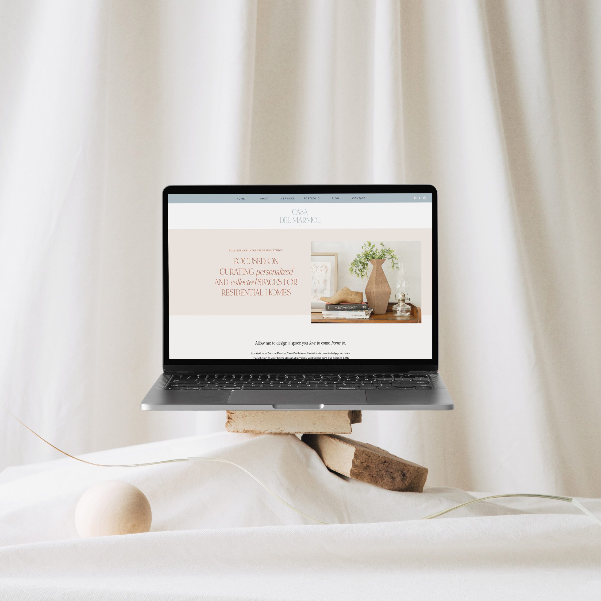
In order to keep the attention of a visitor to your website, you must be able to capture their interest in seconds. One of the reasons why people will click away from a site and visit another is because they can’t quickly find the information they’re looking for. So, include a clear navigation bar at the top!
A basic navigation bar typically includes links to your about, services, portfolio, and contact pages. Of course, some businesses require additional pages, but consider keeping your navigation bar limited because it will lead to a seamless (and fast!) website experience.
Clear Brand Statement on your Home Page
When someone visits your website, they likely have a general idea of who you are and what you do (Google, social media, or a friend may have lead them to your site!). But, it’s important to offer a reminder by clearly stating what you do, who you serve, and where you work. This can be done in 1-2 sentences:
“Hi, I’m/we’re {NAME(s)}, the {TITLE(s)} behind {BUSINESS NAME}! I/We serve {GROUP} in {CITY, STATE}.”
When you’re writing your brand statement, it’s important to be concise, and it’s also important to write and speak to your ideal audience. Check out my homepage to see how I did this clear and concise in the top her image.
Website Keywords throughout your Website
Similar to the above brand statement that clearly states who you are and what you offer to clients through your business, another key thing to consider is keywords. Keywords are the words people will type into search engines, like Google, that will populate a series of suggested sites for the individual to visit. Your goal is to appear in that search. Of course, there are other factors that come into play, like ads, but the process of adding keywords is a form of SEO or search engine optimization. One of the ways to add keywords is to include your title, business name, who you serve, and where you serve them early in your site’s copy.
Call to Action on your Home Page
When someone visit’s your website, what are you imagining they will do as they take next steps? Do you imagine them downloading a PDF from your website? Are you hoping to capture emails for a mailing list? Do you want them to learn more about your services? Are you hoping they will contact you to schedule a meeting so you can learn more about them? These are all important questions to ask yourself when you’re designing your home page.
You will need to guide the visitor through the steps you would like them to take. For example, if you’re hoping they will take a look at your services page, link to it from your copy. If you’re hoping they will contact you, link to your contact page. If email addresses are your goal, a popup asking them to provide their address in exchange for a free PDF might be a great step to take. There are plenty of options, but you will need to put yourself in their shoes in order to decide the best path forward.
Service Offerings on your Home Page
It’s important for website visitors to get to know you on your home page, but it’s perhaps even more important for them to learn about what you do. There are a few ways to talk about your service offerings, and we suggest doing both!
First, as we mentioned earlier, include a services tab as part of your navigation bar. That makes it simple and fast for a website visitor to click to that page of your site for a more extensive explanation of what you do for your clients and the variety of packages you offer.
Second, highlight your services in a small section on your home page. Most visitors will scroll down through the page while they’re in their initial phases of learning more. In order to continue to keep their attention, consider listing a few of your most popular services as quick bullet points or include 1-2 sentences about your offerings. Additionally, include links to both your services page (for those who would like to learn more), and your contact page (for those who have learned enough to know they definitely want to move forward and potentially work together).
What is something you love about your website’s home page? What is something you know you want to change? Let’s keep the conversation going!


