Don’t get me wrong, Instagram is hard to keep up with and I don’t claim to be an expert but I have found a few resources that have helped me tremendously with the overall look and ease of my feed. Hopefully my secrets to a curated Instagram Feed will inspire you to create some engaging posts.
Content
Create Content Buckets or subjects/topics you always want to post about. For example, services, behind the scenes, education or highlighting another person you follow. This makes it easier when you sit down and write your content and stay within the goals of your business. It’s also a good idea to create new hashtags for each of your content buckets each month to keep them fresh
Organization
A nice looking feed does take some time to get right. I use Planoly to layout my grids to make sure posts look good next to each other. I try not to put two cluttered images next to each other, yet separate them by a solid color post as well. Planoly lets you see how all of your images will look laid out together before actually posting them on Instagram. It’s a good place to sit down and write out your content for the week so you don’t have to worry about it on the fly.
Design
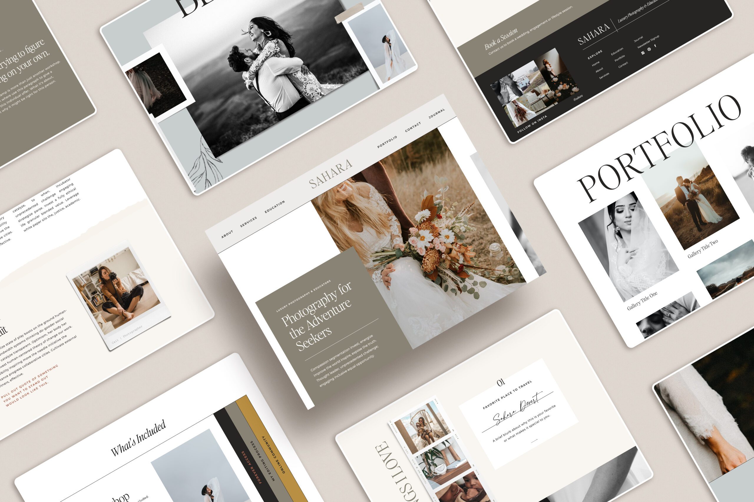
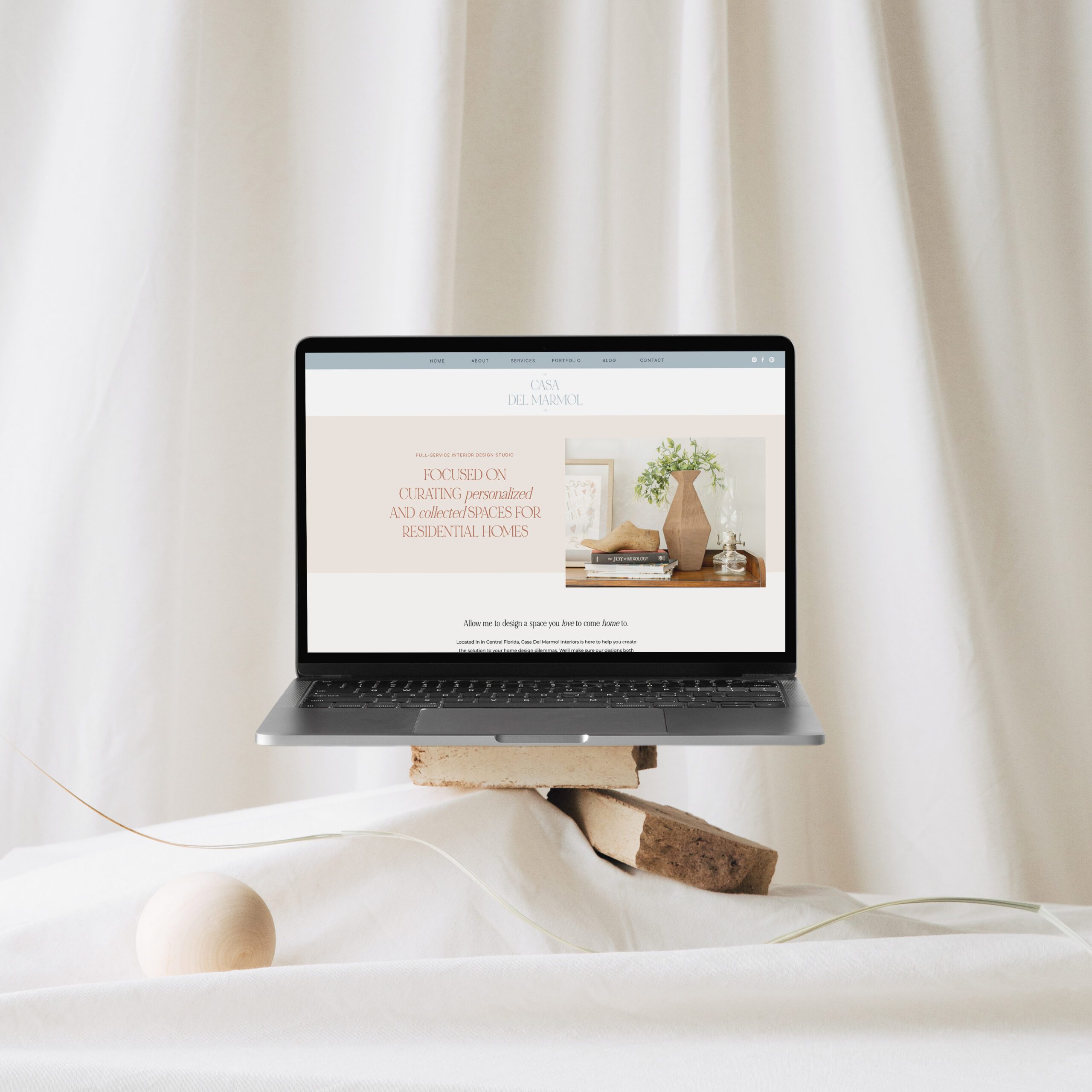
Now for my biggest game changer with the overall look of my feed is using images and product mockups from MOYO Studio. They crated the studio in the pursuit of producing beautiful imagery and design tools to support small businesses and creative entrepreneurs. In my opinion they have achieved their goal. They have the nicest, minimal and clean images and photos that fit my design style. I have completely overhauled my feed and portfolio with their mockups and images. You will have to check out their mockups and images. I went all in with their membership and it has been so valuable in my business. Go give them a look!

You may also like:
Finding the Best Tools, Courses, & Resources as a New Designer


