Logo Submarks, Variations and Elements—What are They and How to Use Them
After going through your branding process with your designer, hopefully it was an amazing experience for you and yay, it’s time to celebrate—you finally have the logo you’ve been dreaming of!
But wait… then the designer hands off your files bursting with logos, how are you supposed to know which one to use when? Let’s review all of the logo submarks, variations and elements – what they are and how to use them.
As a designer, I’m personally guilty of not always explaining which logo format to use when. I sometimes assume my brand style guide will speak for itself because hey, it just looks so darn pretty, isn’t that enough! Unfortunately, no. I’ll break it down for you and explain what the difference is between each logo type: main logo, logo variation, submark and logo elements—as well as common used for each. And, more importantly, WHY you need more than just one logo.
Brand Style Guide
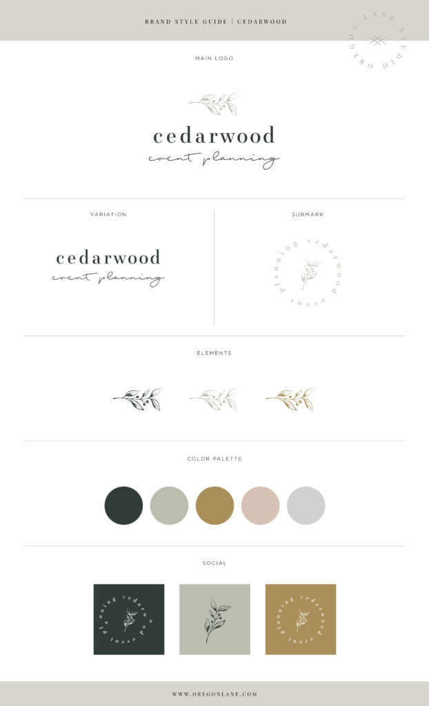
First off, hopefully your designer supplied you with a detailed brand style guide which clearly labels what logo is what. Below is an example of what I give each of my clients after finishing their branding package. I also have several over on my portfolio page if you want to check those out. It clearly labels which logo is which. I typically include a primary logo, logo variation, logo submark and either an element or pattern. Not every brand is the same, each business has different needs. Not all clients need a pattern or element, yet will need multiple variations, or multiple submarks for multiple services, etc.

Primary Logo
This one is pretty obvious, your primary logo is the main logo you will use for your brand. It is used the most often and on almost everything including your website, business cards, printed materials, signage etc.
Logo Variation
A logo variation is a version of your primary logo, just re-arranged in a different format, sometimes referred to as your secondary logo. For example, if your primary logo is in a horizontal format, sometimes space doesn’t always allow those exact dimensions. Instead of shrinking your logo, your designer should provide you with a different layouts to suit your different needs that may arise so your logo is always legible. Another variation of your logo that your designer should provide is a one-color logo option. For example if your primary logo has two colors or more, your designer should also provide you with a one-color option, typically black, when full color printing isn’t an option.
Logo Submark
Your logo submark is a less detailed version of your primary logo that can be used as a secondary mark similar to a watermark. For example, It can often be used on secondary pages of printed materials to still keep your branding in place but when your main logo isn’t needed on every single page. It can also be used as social media profiles, website footers or favicons, back sides of business cards, etc. Many photographers use their logo submark as a watermark on their photo proofs. Some businesses even have a different logo submark for each one of their services. It’s a way to give each branch of their business a logo with still having a cohesive brand. A logo submark allows for a more playful way to incorporate your branding into your designs.
Logo Elements
Logo elements can be anything from patterns, textures, icons, or anything else that ties your brand together and is recognizable through your branding. In my example the elements are simply the floral element from the main logo. These typically don’t include words or brand names and are usually just an icon, design or pattern that can be used throughout all branding pieces. Elements should be used as a supplement to your branding. Either your main logo or variation should always be used in accompany with the element.
I hope this gives you a better understanding why there are so many logo options and when to use each one of them. Each individual logo and element work together to make your brand cohesive and recognizable. It allows you to incorporate multiple logos into your branding in a more versatile way. If you are looking to rebrand or start your logo design process, make sure your designer will be designing an entire branding package for you and not just one logo, as you see here they all work together to create your brand identity.
If you have any questions about branding or maybe you don’t have all of these other fancy logo options and you’d like to incorporate more branding options into your business, I’d love to chat!
